Sayart.net - Quang San Art Museum Unveils New Visual Identity That Reflects Its Artistic Vision and Architecture

  • September 06, 2025 (Sat)

Quang San Art Museum Unveils New Visual Identity That Reflects Its Artistic Vision and Architecture

Sayart / Published August 28, 2025 01:22 PM
  • -
  • +
  • print

The Quang San Art Museum (QSAM), Ho Chi Minh City's first private art museum dedicated exclusively to Vietnamese fine arts, has launched a comprehensive new visual identity developed in collaboration with local creative design firm M&N Associates. The rebranding initiative draws its inspiration directly from the museum's distinctive architecture and its innovative curatorial philosophy, positioning QSAM as a dynamic space for artistic exploration and creative innovation.

Since opening its doors in 2023, QSAM has established itself as more than just a traditional exhibition space. The museum's core philosophy centers on creating an immersive experience that allows visitors to not merely observe art but to genuinely feel and connect with it on an emotional level. Housing an impressive collection of approximately 1,600 artworks that span both classical and contemporary Vietnamese art, the museum creates a continuous dialogue between different artistic periods, fostering meaningful conversations between past and present.

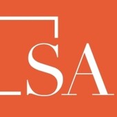
The design team at M&N Associates found profound inspiration in both the aesthetic beauty of the museum's collection and its unique curatorial approach. Working under the guiding concept of "Layers of Contemplation," they developed a logo that symbolically represents the complex processes involved in both creating and experiencing art. The most striking element of the new identity is the transformation of the letter "A" in the museum's acronym into a blank rectangle, which serves multiple symbolic functions as a canvas, a picture frame, and a window into artistic possibilities.

This innovative logo design extends beyond static applications into dynamic digital experiences. On the museum's website, for example, the rectangular "A" incorporates and displays different aspects of the page's content as visitors scroll through the site, creating an interactive visual experience that mirrors the museum's philosophy of evolving artistic dialogue. This approach reinforces the idea that art, like the museum's identity, is not static but constantly changing and revealing new layers of meaning.

The museum's striking architecture played an equally important role in shaping the visual identity. The building's angular column façade and serene, elegant interior spaces provided crucial reference points for M&N Associates' creation of a custom typeface that reflects the architectural rhythm and character of QSAM. This bespoke typeface features distinctive curved terminals and asymmetric cuts that echo the building's geometric elements, while also incorporating forms that visually reference brushstrokes on canvas, connecting the typography directly to the act of painting and artistic creation.

To complement their custom typeface, the design team incorporated fonts from Berlin-based type foundry NaN, specifically utilizing NaN Serf and NaN Serf Sans throughout the identity system. This combination creates a cohesive typographic palette that balances the custom elements with established, professional typefaces, ensuring both uniqueness and readability across all applications.

The museum's website design represents a digital extension of the "Layers of Contemplation" concept, featuring a series of layered rectangles that create depth and visual interest. The site maintains a spacious and soft aesthetic that directly reflects QSAM's contemplative atmosphere, allowing visitors to navigate the digital space with the same sense of quiet reflection they would experience within the physical museum walls. The subtle color palette used throughout the website deliberately takes a supporting role, ensuring that the featured artworks remain the primary focus while visitors explore the digital environment.

According to M&N Associates, every aspect of the website design reinforces the museum's core identity and mission. From the carefully considered color palette to the strategic placement of artwork images, each element serves a specific purpose in creating a unified, immersive experience. Even functional elements like buttons and navigation menus are designed to feel like framed elements, maintaining visual consistency with the museum's artistic focus and ensuring that the digital experience feels authentically connected to the physical space and its curatorial vision.

WEEKLY HOTISSUE