Type designer Ruslan Abasov has developed a unique approach to font creation that combines geometric forms, photography, and unconventional tools, describing his process as similar to dancing with his arm. The designer, who is currently based in Lausanne, Switzerland, creates playful typefaces rooted in his passion for design education and his multicultural background working with both Cyrillic and Latin scripts.
Abasov's journey into typeface design began during his enrollment at design schools in Istanbul, where he experienced what he describes as a revelation. His interests in geometric forms, photography, and design theory converged when he attended an IsType conference, which ultimately inspired him to pursue formal type design studies at ECAL (École cantonale d'art de Lausanne). This educational path shaped his current approach to treating letters as textural shapes and viewing the alphabet as narratives or acts of storytelling.
One of Abasov's most innovative projects, Mouris Display, demonstrates his willingness to experiment with unconventional design tools. Named after the French word for mouse, this typeface emerged from a constrained brief that challenged him to develop a unique tool that would create a distinctive writing style. Rather than using traditional calligraphy or writing instruments, Abasov followed a collaborator's suggestion to create letter shapes using a 1990s-style computer mouse equipped with a silicon trackball.
The creation process for Mouris Display involved soaking the trackball in fast-drying ink and freestyling with the device, exploring its natural bouncy movements. This experimental approach led Abasov to describe the experience as 'dancing with his arm,' emphasizing the physical and fluid nature of his design process. The resulting typeface captures the organic, unpredictable movements of the unconventional tool.
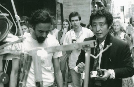
Another significant work in Abasov's portfolio is Daido Display, an expressive typeface that serves as a poetic reflection of typographic discourse inspired by photographer Daido Moriyama. Fascinated by Moriyama's masterful interplay of light and shadow, Abasov concentrated on capturing the core elements of the photographer's visual language. 'Throughout the entire design process I was contemplating the universe of the typeface – by which I mean its music, its feeling, its color code, and photographic sensibility. Thankfully, all of this was already there at the highest level,' Abasov explains.
Escargot Display represents yet another exploration in Abasov's experimental approach, focusing on machine-dictated Bezier drawing. This project emphasized collaboration and the relationship between forms and counter-forms. Working with the keywords 'condensed' and 'slow,' Abasov incorporated flavors of Art Nouveau and dreamlike forms that dance around uppercase letters. These design choices were specifically intended to emphasize slowness within the rigid constraints of a restrained sans-serif typeface structure.
Abasov draws parallels between his typeface design work and filmmaking, viewing both as collaborative creative processes. 'I treat my typefaces like films. The two practices share many parallels. In the film industry, you receive a brief or script from a production company based on market needs; you gather your cast,' he explains. However, he notes a key difference: 'In type design, we don't have this kind of large orchestra or union-based system. Instead, the result often appears as the intellectual property of a single designer, or of a small group in the case of foundries.'
The designer's multicultural background, having worked with both Cyrillic and Latin scripts, has significantly influenced his approach to typography. This experience has given him a unique perspective on letters as textural shapes rather than merely functional characters, allowing him to approach each project with fresh eyes and innovative solutions. His work continues to push the boundaries of traditional type design while maintaining a strong foundation in design theory and educational principles.


