Nuits Sonores, an annual electronic music festival held in Lyon, France, has unveiled a striking new visual identity for 2025 that transforms typography into a living representation of sound itself. The innovative design, created by DIA Studio in collaboration with Brazilian creative technologist André Burnier, features a custom typeface made of pulsating particles that mimics the rhythm and pulse of electronic music.
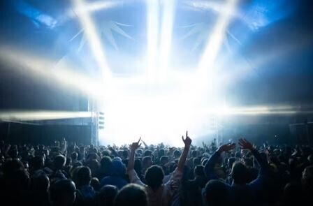
The festival, backed by the organization Arty Farty, follows a tradition of selecting different design agencies each year to create fresh visual identities through an open brief process. This year's design transforms the traditional French city of Lyon into a vibrant electronic music hub over one weekend. "It's wild to see Lyon, which is a pretty traditional French city transformed like this," says Mitch Paone, partner and creative director at DIA Studio.
The centerpiece of the identity is a sophisticated generative motion tool that DIA developed with Burnier, allowing the creation of both high-resolution static images and dynamic motion graphics in various aspect ratios for seamless implementation across all festival materials. The execution features spatially expressive design elements with fluid, rippling motion that moves like liquefied sound waves across screens and surfaces.
"We're recreating the pulse of music and rhythm through typography and particles, almost as if you could see the sound emanating from the speakers, but in this case, particles are blasting out the type," Paone explains. This approach creates what he describes as a "techno meets punk vibe" that captures the festival's industrial aesthetic and electronic music focus.
The design system incorporates a custom typeface called MNKY Klaus from MNKY Type, where Paone also serves as a partner and type designer. This neutral typeface functions as a visual anchor that grounds the more chaotic animated elements, serving as what Paone calls "a visual metronome tying the identity to one beat." The typography provides stability while the particle effects create movement and energy.
The comprehensive design system extends across all aspects of the festival's visual presence, including the website, social media content, signage, posters, merchandise, and promotional materials. DIA Studio went beyond typical deliverables by providing Arty Farty with a custom tool that enables continued versatility and adaptation of the visual identity even after the project's completion.
One of the most remarkable aspects of the 2025 identity was how the distinctive neon green accent color became an integral part of the festival experience itself. Festival attendees spontaneously embraced the vibrant hue, incorporating it into their outfits, dyeing their hair neon green, and bringing glow sticks that matched the brand colors. This organic adoption of the visual identity created an immersive experience where the community became active participants in the design itself.
"The neon-green accents of the identity coincidentally became a big part of the wider experience, where attendees wore the color, dyed their hair, brought glow sticks, and so on, inadvertently making the community a participant in the identity itself, which was fun to witness," Paone reflects. This unexpected community engagement highlighted the power of effective visual design to create cultural moments beyond traditional branding applications.
For Paone, the project's success lay in achieving the delicate balance between creative expression and practical functionality. The design needed to be visually striking and conceptually aligned with electronic music culture while remaining versatile enough to work across diverse applications and media formats.
Looking toward the future, this collaboration with creative communities has inspired DIA Studio to expand its cultural engagement initiatives. The agency plans to launch a curatorial and cultural platform in the near future, designed to foster deeper connections with creative communities. Additionally, DIA has announced plans to begin an annual series of wine bottles designed by artists the studio admires, further expanding their intersection of design and cultural experiences.
The Nuits Sonores project represents a successful fusion of technology, typography, and music culture, demonstrating how thoughtful design can enhance and amplify the essence of cultural events. The project's impact extended far beyond traditional brand recognition, creating a shared visual language that united festival-goers and became part of the event's cultural DNA.


